You’ve bought your first Bitcoin. Now you’re staring at a screen filled with red and green bars, mysterious lines crisscrossing everywhere, and numbers that seem to change every second. Someone mentions “crypto charts,” “support levels,” and “moving averages,” but you’re not sure if they’re speaking English or a foreign language.
Here’s the truth most beginners don’t realize: reading crypto charts isn’t about predicting the future. It’s about understanding what the market is telling you right now. Those intimidating candlesticks, trend lines, and indicators? They’re just visual stories about buyer and seller behavior. Once you understand the language, everything clicks into place.
This guide breaks down cryptocurrency chart reading in plain English. You’ll learn how to read candlestick charts, identify trends, spot patterns that actually matter, and use technical indicators without the confusion. By the end, you’ll confidently analyze Bitcoin charts and make informed decisions instead of emotional guesses.
Table of Contents
- Why Learning to Read Crypto Charts Matters
- Understanding Cryptocurrency Chart Basics
- How to Read Candlestick Charts (Step-by-Step)
- Support and Resistance: The Foundation of Chart Reading
- Identifying Crypto Market Trends
- Essential Moving Averages for Crypto Trading
- Top 10 Chart Patterns Every Crypto Trader Should Know
- Best Technical Indicators for Beginners
- How to Analyze a Crypto Chart: Complete Checklist
- Common Mistakes When Reading Crypto Charts
- Frequently Asked Questions
- Final Thoughts: Your Chart Reading Journey
- About This Guide
- References
Why Learning to Read Crypto Charts Matters
Learning to read crypto charts transforms you from a gambler into an informed trader. Without this skill, you’re essentially throwing darts blindfolded. You buy when everyone’s excited and sell when panic strikes – a recipe for consistent losses.
Understanding cryptocurrency charts gives you three critical advantages. First, you spot opportunities others miss. While beginners chase yesterday’s news, you identify potential reversals before they happen. Second, you avoid emotional decisions. When Bitcoin drops 15% in a day, charts tell you whether it’s a healthy correction or the start of a crash. Third, you develop timing skills. The difference between buying at $40,000 and $38,000 might seem small, but it compounds significantly over multiple trades.
Here’s what makes crypto charts different from stock charts: cryptocurrency markets never close. While stock traders analyze 6.5-hour trading days, crypto moves 24/7 across global exchanges. This creates unique patterns and requires different analysis approaches. Volatility is also extreme – 20% daily swings are common in crypto but would trigger circuit breakers in traditional markets.
The good news? Crypto technical analysis follows the same principles as traditional markets. Once you master reading Bitcoin charts, you can analyze Ethereum, Solana, or any other cryptocurrency. The skills are transferable and valuable across the entire ecosystem.
Understanding Cryptocurrency Chart Basics
Before diving into candlesticks and patterns, you need to understand what you’re looking at. Every crypto chart displays the same fundamental information in slightly different ways.
What Makes Crypto Charts Different from Stock Charts
Cryptocurrency charts operate on continuous time. There’s no opening bell or closing bell. Bitcoin trades at 3 AM just as actively as 3 PM. This 24/7 nature creates patterns you won’t see in traditional markets.
Liquidity varies dramatically by exchange. The same Bitcoin can trade at slightly different prices on Coinbase versus Binance versus Kraken. This fragmentation means you should focus on the largest, most liquid exchanges for accurate price discovery.
Volatility defines crypto. A 5% move in stocks is significant news. In cryptocurrency, 5% moves happen daily and barely register as noteworthy. This means support and resistance levels break more frequently, and false breakouts are common.
Regulation – or lack thereof – impacts price action differently. While stock markets have circuit breakers that pause trading during extreme moves, crypto exchanges let prices run freely. Flash crashes can be severe and swift.
Chart Components: Understanding the Basics
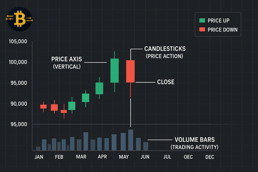
Every cryptocurrency chart displays four essential elements. The price axis runs vertically, showing the cost of the cryptocurrency. The time axis runs horizontally, showing when trades occurred. The volume bar appears below the main chart, indicating how many coins traded during each period. The candlestick or line represents actual price movement during that timeframe.
Think of charts as visual representations of supply and demand. When more people want to buy than sell, prices rise. When more people want to sell than buy, prices fall. The chart simply records this eternal battle between bulls and bears.
Choosing Your Chart Timeframe
Timeframes determine what each candlestick or data point represents. Understanding crypto trading timeframes is crucial for your strategy.
The 1-minute to 15-minute charts show ultra-short-term movements. Day traders use these for quick entries and exits. However, they’re noisy and prone to false signals.
The 1-hour to 4-hour charts balance detail with clarity. Swing traders who hold positions for days or weeks often rely on these timeframes. They filter out market noise while showing meaningful trends.
The daily chart is the gold standard for beginners. Each candlestick represents one full day of trading. Daily charts show the market’s true direction without overwhelming detail. Most successful strategies start with daily chart analysis.
The weekly and monthly charts reveal long-term trends. If you’re investing in crypto rather than trading, these timeframes help you ignore short-term volatility and focus on the bigger picture.
Here’s the key: Always check multiple timeframes. A cryptocurrency might look bullish on the 15-minute chart but bearish on the daily chart. The larger timeframe usually matters more. Start with the daily chart, then zoom in to hourly for entry timing.
How to Set Up Your First TradingView Chart
TradingView is the industry standard for crypto chart analysis. It’s free for basic features and works on any device.
Step-by-step setup:
- Visit TradingView.com and create a free account
- Search for your chosen cryptocurrency (type “BTCUSD” for Bitcoin)
- Select a reputable exchange (Coinbase, Binance, or Kraken)
- Change the chart type to “Candles” if it shows lines
- Set your timeframe to “1D” (daily) for learning
- Adjust zoom to show 6-12 months of price history
Recommended settings for beginners:
- Chart type: Candlesticks
- Timeframe: 1 Day initially
- Remove unnecessary indicators (start clean)
- Enable volume bars at the bottom
- Switch to dark mode for reduced eye strain
Once you’re comfortable with basic navigation, you can explore TradingView’s drawing tools. But initially, just get familiar with reading the raw price action.
How to Read Candlestick Charts (Step-by-Step)
Candlestick charts are the most popular way to visualize cryptocurrency price action. They show more information than line charts while remaining easy to read once you understand the basics.
Reading Green vs Red Candlesticks
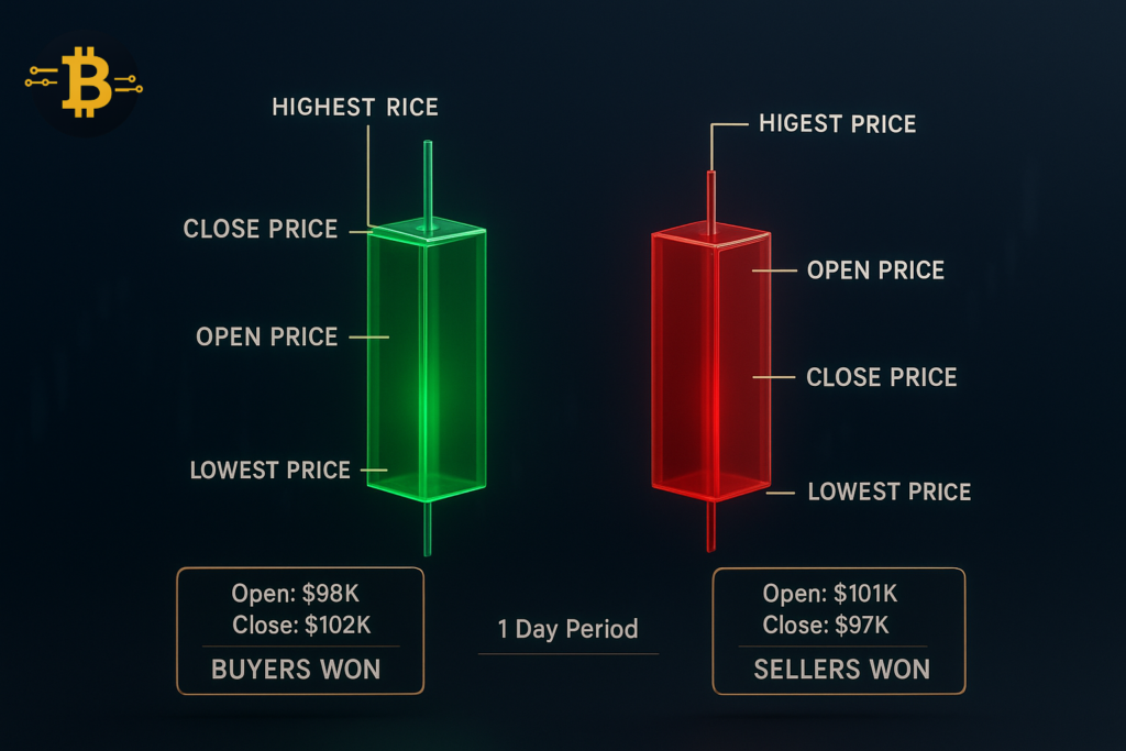
Each candlestick tells a story about a specific time period. The color immediately shows who won the battle – buyers or sellers.
Green candlesticks (sometimes white) mean buyers won. The price closed higher than it opened during that period. The bottom of the green body shows the opening price. The top shows the closing price. Buyers pushed the price up, creating upward pressure.
Red candlesticks (sometimes black) mean sellers won. The price closed lower than it opened. The top of the red body shows the opening price. The bottom shows the closing price. Sellers pushed the price down, creating downward pressure.
The color tells you the outcome, but the size and shape tell you how intense the battle was.
The Anatomy of a Candlestick Explained
Understanding cryptocurrency candlestick patterns starts with knowing the three parts of every candlestick.
The body is the thick, colored rectangle. It represents the range between opening and closing prices. A large body indicates strong directional movement. A small body (called a “spinning top”) suggests indecision.
The upper wick (or shadow) is the thin line extending above the body. It shows the highest price reached during that period. Long upper wicks indicate sellers pushed back against buyers who drove prices higher temporarily.
The lower wick extends below the body. It shows the lowest price reached during that period. Long lower wicks indicate buyers pushed back against sellers who drove prices lower temporarily.
Here’s a practical example: Imagine a daily candlestick on Bitcoin. It opens at $98,000 (bottom of body), drops to $96,000 (lower wick), rallies to $101,000 (upper wick), then closes at $99,500 (top of body). This green candlestick tells you: Bitcoin started at $98K, experienced a $2K drop that buyers rejected, peaked at $101K where sellers pushed back, and ultimately closed higher at $99.5K. Buyers won the day, but it was contested.
Common Candlestick Patterns That Signal Trend Changes
Certain candlestick formations signal potential reversals or continuations. Master these patterns and you’ll spot opportunities early.
Doji candlestick: The body is virtually nonexistent – opening and closing prices are nearly identical. This signals indecision. After a strong uptrend, a doji suggests buyers are losing momentum. After a downtrend, it suggests sellers are exhausted.
Hammer pattern: A small body at the top with a long lower wick (at least twice the body length) and little or no upper wick. This appears at the bottom of downtrends. It shows sellers pushed prices lower, but buyers rejected those levels strongly. It signals a potential reversal upward.
Shooting star pattern: The opposite of a hammer. Small body at the bottom, long upper wick, little or no lower wick. This appears at the top of uptrends. It shows buyers pushed prices higher, but sellers rejected those levels. It signals a potential reversal downward.
Engulfing patterns: Two candlesticks where the second completely engulfs the first. A bullish engulfing occurs when a large green candle completely covers a previous red candle. This suggests buyers have taken control. A bearish engulfing is the opposite – a large red candle swallows a previous green one.
Important note: Never trade based on a single candlestick pattern alone. Confirm with volume, support/resistance levels, and overall trend context. Patterns increase probability but don’t guarantee outcomes.
How Volume Confirms Candlestick Patterns
The volume indicator crypto traders use appears as bars below the price chart. Volume shows how many coins traded during each period. High volume confirms conviction behind price moves. Low volume suggests weak commitment.
When you spot a hammer candlestick at a support level, check the volume. High volume on that hammer indicates strong buyer interest at that price. This makes the reversal signal more reliable. Low volume suggests fewer participants care about that level.
Volume principles:
- Rising prices + rising volume = healthy uptrend (confirmed)
- Rising prices + falling volume = weak uptrend (suspect)
- Falling prices + rising volume = healthy downtrend (confirmed)
- Falling prices + falling volume = weak downtrend (suspect)
Think of volume as the fuel for price movement. Without sufficient volume, prices tend to reverse quickly. Major breakouts require heavy volume to sustain momentum.
Support and Resistance: The Foundation of Chart Reading
Support and resistance levels are the foundation of crypto technical analysis. Master these concepts and you’ve mastered 80% of chart reading.
What Is Support in Cryptocurrency Charts?
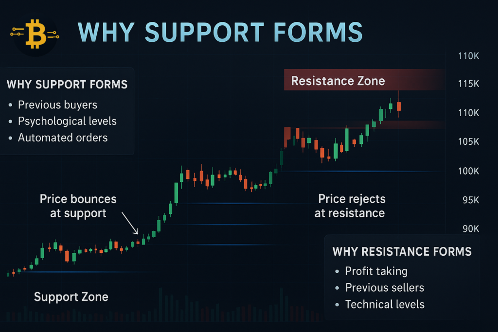
Support is a price level where buying pressure prevents further decline. It’s where buyers say “this price is attractive enough to buy.” Think of it like a floor under the price.
When Bitcoin drops to $95,000 and bounces back up repeatedly, $95,000 becomes a support level. The market has shown multiple times that buyers appear at this price, creating a psychological barrier.
Why support levels form: Buyers who missed previous opportunities wait for prices to return to certain levels. Traders who sold earlier want to buy back at their previous entry point. Automated trading bots place buy orders at technical levels. These combined forces create visible support.
The more times a support level holds, the stronger it becomes. If Bitcoin bounces off $95,000 three times, traders notice and trust that level more. This creates a self-fulfilling prophecy where even more buyers place orders near $95,000.
How to Identify Support Levels on Bitcoin Charts
Finding crypto support levels requires looking at historical price action. Open your chart and zoom out to see several months of data.
Method 1: Find previous lows. Look for points where the price stopped falling and reversed. These turning points often become future support levels. If Bitcoin previously found support at $85,000, that level remains significant even months later.
Method 2: Previous resistance becomes support. Once price breaks through resistance, that level often becomes support on the way back down. If Bitcoin struggled to break $100,000 for weeks, finally broke through, then later pulled back, $100,000 often provides support.
Method 3: Round numbers act as psychological support. Humans love round numbers. $90,000, $100,000, and $110,000 act as natural support levels because traders place orders at these clean numbers.
Draw horizontal lines at these levels on your chart. You don’t need precision – a support “zone” between $95,000-$96,000 is more realistic than expecting exact support at $95,247.
Understanding Resistance in Crypto Trading
Resistance is the opposite of support. It’s a price level where selling pressure prevents further gains. Sellers say “this price is attractive enough to take profits.” Think of it as a ceiling above the price.
When Ethereum rises to $3,800 and gets rejected multiple times, $3,800 becomes resistance. The market shows that sellers consistently appear at this price.
Why resistance forms: Previous buyers who are now underwater wait for break-even to sell. Profit-takers set target prices. Short-sellers enter positions at technical levels. These combined forces create visible resistance.
The longer a resistance level holds, the more significant the eventual breakout becomes. If Ethereum tests $3,800 five times without breaking through, when it finally does break through, the move tends to be explosive.
Support and Resistance Role Reversal
Here’s a critical concept: support and resistance flip roles when broken. This is one of the most reliable patterns in technical analysis.
When price breaks above resistance, that level often becomes new support. Imagine Bitcoin struggling at $105,000 resistance for weeks. Finally, it breaks through and reaches $110,000. When it pulls back, $105,000 (former resistance) often provides support.
Why does this happen? Traders who missed the breakout wait for a pullback to enter. Those who bought the breakout add to positions on the retest. Previous sellers regret their decision and buy back. These factors create buying pressure at the former resistance.
The same works in reverse. When support breaks, it becomes resistance. If Bitcoin’s $95,000 support finally breaks and drops to $90,000, rallies back up often stall at $95,000 (now resistance).
Trading strategy: When a major resistance level breaks with high volume, wait for a pullback to that level (now support) before entering. This provides a lower-risk entry point than chasing the breakout immediately.
Identifying Crypto Market Trends
Trend identification is the most important skill in technical analysis. Trade with the trend and you have the wind at your back. Trade against it and you’re fighting a losing battle.
The Three Types of Market Trends
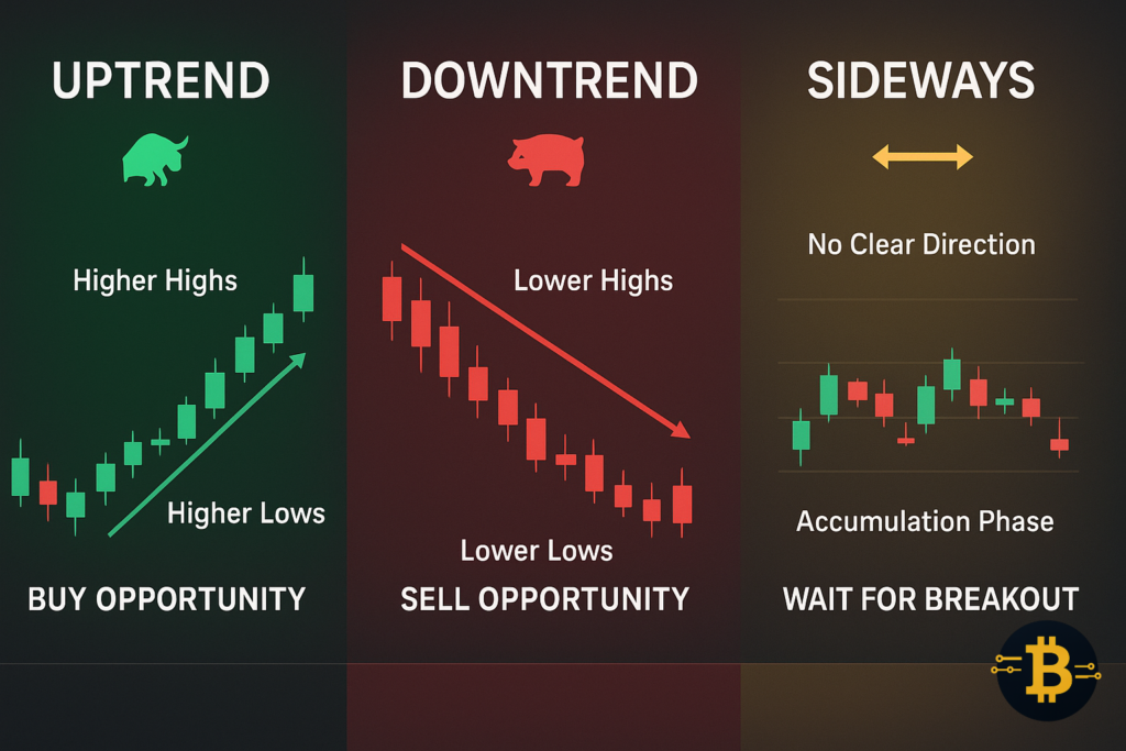
Cryptocurrency markets exist in one of three states: uptrend, downtrend, or sideways. Understanding which trend you’re in determines your trading strategy.
Uptrends (bull markets) occur when prices make higher highs and higher lows. Each peak is higher than the previous peak. Each dip bottoms at a higher level than the previous dip. This shows buyers are increasingly willing to pay more, and sellers are demanding higher prices.
Bitcoin showing an uptrend might bounce from $92,000 to $98,000, pull back to $94,000, rally to $102,000, pull back to $96,000, then push to $106,000. Notice each low ($92K, $94K, $96K) is higher than the last, and each high ($98K, $102K, $106K) is also higher.
Downtrends (bear markets) are the opposite. Prices make lower highs and lower lows. Each peak is lower than the previous peak. Each dip reaches a lower level than before. This shows sellers are accepting less, and buyers aren’t willing to pay previous prices.
Sideways trends (consolidation or ranging markets) occur when price bounces between a clear support and resistance level without making progress in either direction. Bitcoin might oscillate between $95,000 and $102,000 for weeks. This represents market indecision and accumulation.
How to Draw Trendlines on Crypto Charts
Trendlines are diagonal lines connecting price points that show trend direction. They’re simple but powerful tools for trend identification.
Drawing uptrend lines: Connect at least two higher lows with a straight line. The more times price bounces off this line, the more significant it becomes. This line acts as dynamic support – support that rises over time. When price is above this line, the uptrend remains intact.
Drawing downtrend lines: Connect at least two lower highs. This creates dynamic resistance – resistance that falls over time. When price remains below this line, the downtrend is active.
Best practices for trendlines:
- Use at least three touch points for confirmation
- Don’t force lines to fit – let price action guide you
- Expect minor breaks that don’t invalidate the trend
- Draw lines through wicks, not just bodies
- Update trendlines as new price action develops
Critical concept: Trendline breaks signal potential trend changes. When an uptrend line breaks with strong volume, consider it a warning that the uptrend might be ending. However, one break doesn’t confirm a reversal – wait for price to make a lower low.
Trend Confirmation Using Higher Timeframes
A common beginner mistake is trading counter to the higher timeframe trend. You see an uptrend on the 15-minute chart and buy, unaware that the daily chart shows a strong downtrend.
Multi-timeframe analysis process:
- Start with the daily chart to identify the primary trend
- Move to the 4-hour chart to see intermediate trends
- Use the 1-hour chart for entry timing
- Ignore timeframes under 1 hour initially
If the daily chart shows an uptrend, look for buying opportunities on the 4-hour chart pullbacks. If the daily shows a downtrend, focus on selling opportunities during 4-hour rallies.
Think of trends like ocean waves. The daily chart shows the tide (high tide vs low tide). The 4-hour shows the waves themselves. The 1-hour shows the ripples on those waves. Trading the ripples against the tide is difficult and low-probability.
When Trends End: Spotting Reversals
Trends don’t last forever. Knowing when a trend might be ending protects your capital and helps you catch the new trend early.
Warning signs of trend exhaustion:
- Weakening momentum: Rallies in an uptrend become shorter and less steep
- Volume divergence: Price makes new highs but volume declines
- Trendline breaks: Price breaks below the uptrend line with volume
- Failed tests: Price attempts new highs but immediately reverses
- Pattern formations: Head and shoulders or double tops appear at trend extremes
Example: Bitcoin is in an uptrend from $85,000 to $108,000 over three months. The final push from $105,000 to $108,000 occurs on declining volume. Price breaks the uptrend line. A rally back to $108,000 fails and reverses quickly. These are warning signs the uptrend is ending.
Don’t try to catch exact tops or bottoms. Wait for confirmation – a clear lower low in an uptrend or higher high in a downtrend – before assuming the trend has reversed.
Essential Moving Averages for Crypto Trading
Moving averages smooth out price action to reveal trends more clearly. They’re one of the most popular technical indicators for good reason – they work.
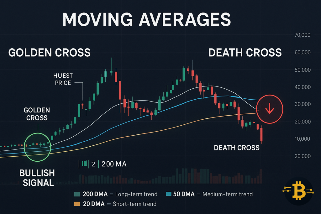
What Is the 200-Day Moving Average?
The 200-day moving average (200 DMA) is the single most important moving average in financial markets, including cryptocurrency. It shows the average closing price over the past 200 days.
This indicator acts as a long-term trend gauge. When price is above the 200 DMA, the long-term trend is bullish. When below, it’s bearish. The 200 DMA also acts as dynamic support in uptrends and resistance in downtrends.
Bitcoin respects the 200-day moving average remarkably well. During bull markets, Bitcoin often pulls back to the 200 DMA, bounces, and continues higher. During bear markets, rallies frequently stall at the 200 DMA before resuming the downtrend.
How to use it: Add the 200-day simple moving average to your daily chart. Watch how price interacts with this line. Bounces off the 200 DMA in an uptrend present buying opportunities. Rejections at the 200 DMA in a downtrend confirm selling pressure.
Important note: The 200 DMA is slow-moving. Don’t expect immediate reactions. It’s for identifying long-term trend and context, not short-term trading signals.
The 50-Day Moving Average and Trend Strength
The 50-day moving average (50 DMA) responds faster to price changes than the 200 DMA. It shows intermediate-term trends and helps time entries within the larger trend.
When the 50 DMA is above the 200 DMA and both are sloping upward, you have strong bullish confirmation. When the 50 DMA is below the 200 DMA and both slope downward, the bearish trend is confirmed.
Practical application: Use the 50 DMA as dynamic support/resistance for position entry. In an uptrend, buy when price pulls back near the 50 DMA. In a downtrend, sell rallies near the 50 DMA.
The space between the 50 DMA and 200 DMA indicates trend strength. Wide separation suggests strong trends. Converging lines suggest weakening trends or consolidation.
Understanding the Golden Cross and Death Cross
The golden cross and death cross are two of the most watched signals in crypto technical analysis.
Golden cross: Occurs when the 50-day moving average crosses above the 200-day moving average. This signals a potential shift from bearish to bullish trend. Historically, golden crosses in Bitcoin have preceded major bull runs.
Death cross: Occurs when the 50-day moving average crosses below the 200-day moving average. This signals a potential shift from bullish to bearish. Death crosses often appear after significant corrections begin.
Reality check: These crosses are lagging indicators. They confirm trends that already started, rather than predicting future moves. By the time a golden cross appears, Bitcoin might have already rallied 20-30%. Don’t treat them as magic signals – use them as confirmation tools alongside other analysis.
Better approach: Watch for potential crosses forming. If the 50 DMA is approaching the 200 DMA from below during a rally, a golden cross is likely soon. This gives you advance warning rather than waiting for the actual cross.
Shorter Moving Averages for Active Trading
Day traders and swing traders often use shorter moving averages: 10-day, 20-day, and 50-day combinations.
The 20-day moving average is popular for swing trading. It balances responsiveness with reliability. Price bounces off the 20 DMA frequently during strong trends, providing entry points.
The 10-day moving average is highly responsive. It follows price closely, making it useful for short-term trading but prone to false signals during choppy markets.
Exponential Moving Averages (EMA) weight recent prices more heavily than older prices. The 12-day EMA and 26-day EMA are components of the MACD indicator. EMAs react faster to price changes than simple moving averages.
Strategy example: Use the 20 EMA for entries in the direction of the 50 DMA and 200 DMA. If all three moving averages align (20 above 50 above 200), only take long positions. Buy when price dips to the 20 EMA with volume confirmation.
Top 10 Chart Patterns Every Crypto Trader Should Know
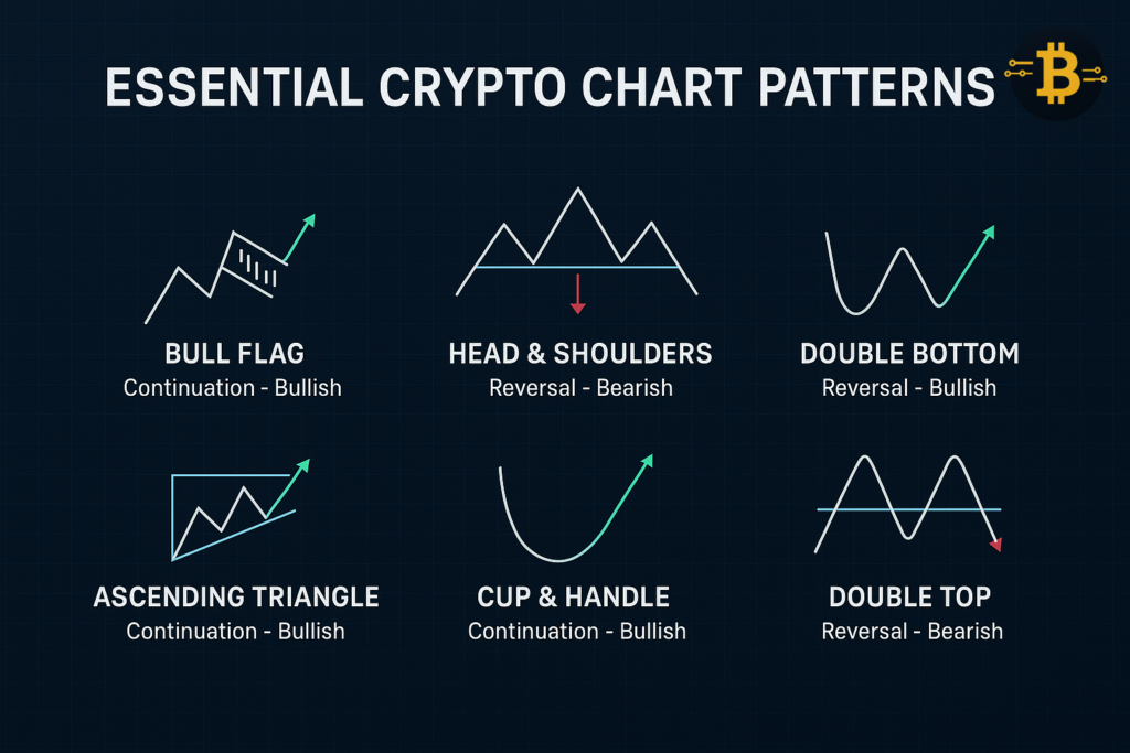
Chart patterns are recurring formations that suggest future price movement. These patterns represent crowd psychology – fear, greed, and indecision – playing out visually on charts.
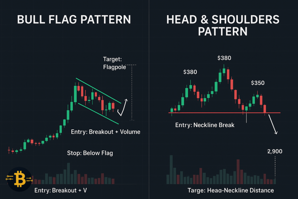
1. Bull Flag Pattern in Crypto
The bull flag pattern crypto traders love is a continuation pattern signaling the uptrend will likely resume after a brief consolidation.
What it looks like: A sharp rally (the flagpole) followed by a tight downward-sloping consolidation (the flag). The consolidation forms parallel trendlines angled slightly downward. Volume decreases during consolidation.
How to trade it: Wait for price to break above the upper trendline of the flag with increasing volume. Measure the flagpole height and project it upward from the breakout point—this estimates the price target.
Example: Bitcoin rallies from $95,000 to $102,000 in three days (flagpole). Then it consolidates between $100,000-$102,000 for a week, forming a downward-sloping channel (flag). When it breaks above $102,000 with volume, the target becomes $109,000 (adding the $7,000 flagpole to the $102,000 breakout).
2. Head and Shoulders Pattern
The head and shoulders pattern bitcoin charts frequently display signals a potential trend reversal from bullish to bearish.
Structure: Three peaks where the middle peak (head) is higher than the two surrounding peaks (shoulders). The shoulders are roughly equal height. A “neckline” connects the lows between the peaks.
Trading the pattern: Wait for price to break below the neckline with volume. This confirms the pattern. The target is calculated by measuring from the head to the neckline and projecting that distance downward from the breakout point.
Inverse head and shoulders: The bullish version. Three troughs where the middle trough (head) is lower than the two surrounding troughs (shoulders). Breakout above the neckline signals potential upside.
Important: The pattern must form after an uptrend to be valid. A head and shoulders in a downtrend lacks context and reliability.
3. Double Top and Double Bottom
These patterns signal potential reversals when price fails to break through a level twice.
Double top: Price rallies to a resistance level, pulls back, rallies again to the same level, then fails and reverses. This shows sellers defending that level successfully twice. The pattern completes when price breaks below the low point between the two peaks.
Double bottom: The inverse. Price falls to support, bounces, falls again to the same support, then reverses upward. Buyers defended the level twice. Pattern confirms on a break above the high point between the two troughs.
Target calculation: Measure from the peaks/troughs to the middle point (the neckline), then project that distance from the breakout.
Real-world reliability: Double tops and bottoms are reliable when they form at major support/resistance levels with volume confirmation. Random double peaks in the middle of trends are less significant.
4. Triangle Patterns: Ascending, Descending, and Symmetrical
Triangle pattern cryptocurrency charts show represent periods of consolidation before breakouts.
Ascending triangle: Flat horizontal resistance with rising support. Shows buyers becoming more aggressive while sellers hold a line. Usually breaks upward. Draw one horizontal line connecting the highs and one rising trendline connecting the lows.
Descending triangle: Flat horizontal support with declining resistance. Shows sellers becoming more aggressive while buyers hold a line. Usually breaks downward. Draw one horizontal line connecting the lows and one declining trendline connecting the highs.
Symmetrical triangle: Converging trendlines – lower highs and higher lows creating a point. Represents equilibrium between buyers and sellers. Can break either direction. Trade the breakout with volume confirmation.
Trading triangles: Wait for a clear break with volume above 150% of recent average. False breakouts are common, so confirmation is essential. Target is typically the height of the triangle’s widest point projected from the breakout.
5. Cup and Handle Pattern
The cup and handle is a bullish continuation pattern showing a rounded bottom (cup) followed by a slight downward drift (handle).
Formation: Price declines, forms a rounded bottom over weeks or months (creating the “cup”), rallies back near the previous high, then pulls back slightly (the “handle”). The handle typically forms in the upper third of the cup.
Trading: Buy when price breaks above the resistance formed by the cup’s rim. Volume should be lighter during the handle formation and increase on the breakout.
Why it works: The cup represents a gradual shift from selling pressure to buying interest. The handle represents a final shakeout of weak hands before the main rally resumes.
6. Wedge Patterns: Rising and Falling
Wedges are similar to triangles but both trendlines slope in the same direction.
Rising wedge: Both trendlines slope upward but converge. Despite the upward movement, this is typically bearish. It shows buying momentum weakening as higher highs become less steep. Usually breaks downward.
Falling wedge: Both trendlines slope downward but converge. Despite the downward movement, this is typically bullish. It shows selling pressure weakening. Usually breaks upward.
Key characteristic: Volume should decrease as the wedge develops and increase on the breakout. This volume behavior confirms the pattern’s validity.
7. Pennant Pattern
Pennants are short-term continuation patterns that look like small symmetrical triangles.
Formation: Sharp price movement (flagpole) followed by a brief symmetrical triangle consolidation. The consolidation typically lasts 1-3 weeks in crypto.
Difference from flags: Pennants are more symmetrical and horizontal, while flags slope against the prevailing trend. Both are continuation patterns but form slightly differently.
Trading approach: Measure the flagpole and project from breakout, similar to bull flags. These patterns often resolve quickly, making them suitable for active traders.
8. Rounding Bottom (Saucer)
The rounding bottom is a long-term reversal pattern showing a gradual shift from bearish to bullish sentiment.
Appearance: Price forms a smooth, U-shaped curve over several months. Unlike the sharp V-shaped reversal, this pattern develops slowly as sentiment gradually shifts.
Volume behavior: Volume should decrease as price forms the bottom and increase as price climbs the right side of the “U.”
Trading: These patterns develop slowly. Don’t try to catch the exact bottom. Wait for the right side of the saucer to form and show strength above key moving averages before entering.
9. Rectangle Pattern (Trading Range)
Rectangles form when price bounces between clear horizontal support and resistance repeatedly.
Trading the pattern: Sell near resistance, buy near support while price remains in the range. Once the pattern breaks (with volume), trade in the breakout direction. The longer the pattern lasts, the more significant the eventual breakout.
Breakout targets: Measure the rectangle’s height and project from the breakout point.
Risk management: Rectangles can persist longer than expected. Use tight stops and don’t risk significant capital on range trades.
10. Diamond Pattern
Diamond patterns are rare but powerful reversal patterns that form at trend extremes.
Structure: Price creates expanding movements (broadening formation) followed by contracting movements (triangle), forming a diamond shape. This shows extreme volatility followed by consolidation.
Occurrence: Most common at market tops after extended rallies. The pattern reflects maximum confusion and participation before a reversal.
Trading: Wait for a clear break and confirmation. These patterns are less reliable than others due to their rarity and complexity.
Best Technical Indicators for Beginners
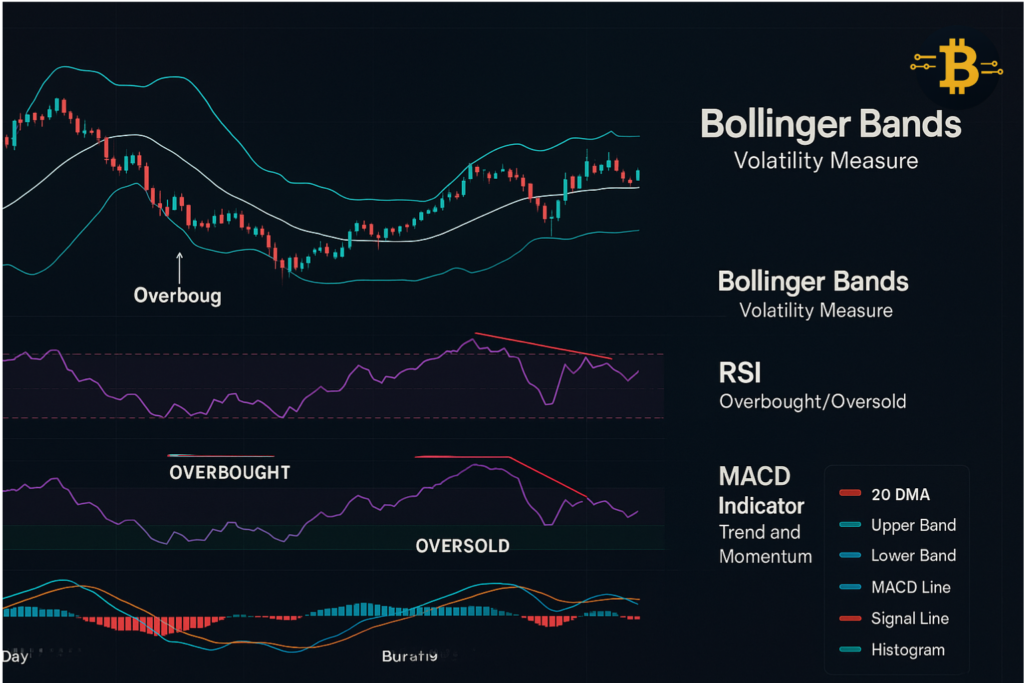
Technical indicators process price and volume data into visual signals. They help confirm what you see on the raw chart. Here are three essential indicators every beginner should master.
RSI Indicator Crypto: Measuring Momentum
The Relative Strength Index (RSI) measures momentum on a scale of 0-100. It identifies overbought and oversold conditions that often precede reversals.
How RSI works: The indicator compares recent gains to recent losses over a specific period (typically 14 days). Values above 70 suggest overbought conditions – the asset has risen too far, too fast. Values below 30 suggest oversold conditions – the asset has fallen excessively.
Using RSI in crypto trading: When Bitcoin’s RSI reaches 30 during a downtrend, it signals potential oversold conditions. This doesn’t mean buy immediately – downtrends can remain oversold for extended periods. Instead, watch for RSI to start climbing back above 30, indicating momentum shift.
Conversely, RSI above 70 during an uptrend signals overbought conditions. Again, don’t automatically sell. Strong uptrends can stay overbought. Wait for RSI to drop back below 70, confirming momentum loss.
RSI divergence – the power move: This occurs when price and RSI move in opposite directions. If Bitcoin makes a new high but RSI makes a lower high, it’s bearish divergence. The price advance lacks momentum support. If Bitcoin makes a new low but RSI makes a higher low, it’s bullish divergence – selling pressure is weakening.
Settings for crypto: The standard 14-period RSI works well on daily charts. For faster signals on lower timeframes, try 9-period RSI, though it generates more false signals.
MACD Crypto Trading: Trend and Momentum Combined
The Moving Average Convergence Divergence (MACD) indicator combines trend following and momentum. It shows the relationship between two moving averages of price.
Components: The MACD line (12-day EMA minus 26-day EMA), the signal line (9-day EMA of the MACD line), and the histogram (difference between MACD and signal line).
Basic signals: When the MACD line crosses above the signal line, it generates a bullish signal. When it crosses below, it’s bearish. The histogram shows the strength of the signal—larger bars indicate stronger momentum.
How to use MACD effectively: Look for crossovers in the direction of the overall trend. If Bitcoin is in an uptrend above the 200 DMA, focus on bullish MACD crossovers (MACD crossing above signal line). Ignore bearish crossovers as they’re likely false signals against the trend.
MACD divergence: Similar to RSI, MACD divergence is powerful. When price makes new highs but MACD makes lower highs, momentum is weakening. When price makes new lows but MACD makes higher lows, selling pressure is exhausting.
Best practices: MACD works best on daily and 4-hour charts. On lower timeframes, it produces too many false signals. Always confirm MACD signals with price action and support/resistance levels.
Bollinger Bands: Measuring Volatility
Bollinger Bands cryptocurrency traders use, measure volatility and identify potential reversal points. The indicator consists of three lines: a middle moving average (typically 20-day) and two outer bands set at two standard deviations above and below the middle.
How they work: When volatility is high, the bands widen. When volatility contracts, bands narrow. Price tends to stay within the bands roughly 95% of the time. Moves outside the bands are notable events.
Trading with Bollinger Bands: When price touches the lower band during an uptrend, it often presents a buying opportunity – price has stretched too far from average. When it touches the upper band during a downtrend, it suggests a selling opportunity.
The “Bollinger Bounce”: In ranging markets, price often bounces between the bands. You can buy near the lower band and sell near the upper band. However, this strategy fails during strong trends when price “walks the bands.”
Bollinger Band squeeze: When bands contract significantly (narrowest in months), it predicts an imminent volatility expansion. Price is coiling for a significant move. The direction isn’t certain, but the magnitude will be substantial. Wait for the breakout and trade in that direction.
Volume + Bollinger Bands: Combine Bollinger Bands with volume analysis. Breakouts beyond the bands on high volume are more likely to sustain. Low-volume tags of the bands often reverse quickly.
Combining Indicators: The Three-Indicator Strategy
Rather than relying on one indicator, combine three for confirmation:
- Moving averages for trend context – Are we in an uptrend (above 200 DMA) or downtrend?
- RSI for momentum – Is momentum aligned with our trade direction?
- Volume for confirmation – Does volume support the price move?
Example setup: Bitcoin is above the 200 DMA (bullish trend). It pulls back to the 50 DMA where RSI shows 35 (oversold). Volume increases as price bounces off the 50 DMA. All three indicators align – this presents a high-probability long entry.
Avoid indicator overload: More indicators don’t mean better trading. Three is enough. Beyond that, you’ll find conflicting signals that paralyze decision-making. Master a few indicators deeply rather than dabbling with dozens.
How to Analyze a Crypto Chart: Complete Checklist
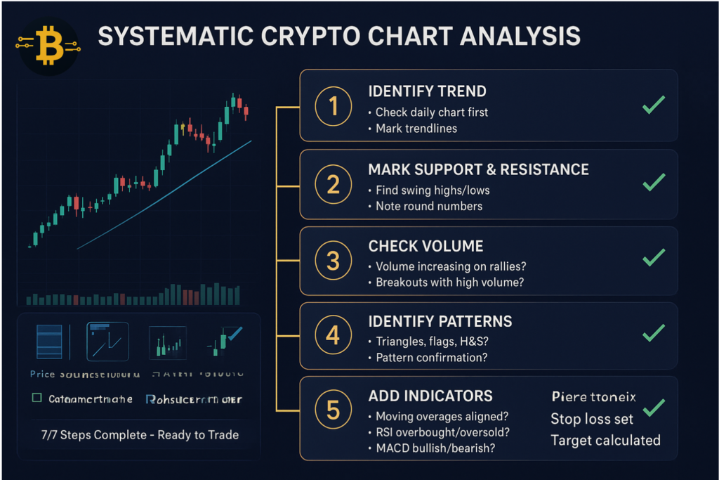
Now that you understand individual components, let’s combine everything into a systematic chart analysis process. This checklist ensures you never miss critical information.
Step 1: Identify the Trend on Multiple Timeframes
Open your chart and start with the largest timeframe.
Daily chart analysis:
- Is price above or below the 200-day moving average?
- Draw trendlines connecting recent highs (downtrend) or lows (uptrend)
- Identify the primary trend direction: up, down, or sideways
4-hour chart analysis:
- Does the intermediate trend align with the daily trend?
- Look for short-term consolidations within the larger trend
Alignment check: If daily shows uptrend but 4-hour shows downtrend, the daily trend matters more. However, wait for the 4-hour to align before entering trades. Trading against the 4-hour trend, even if the daily supports you, increases risk.
Step 2: Mark Support and Resistance Levels
Identify and draw horizontal lines at key price levels.
Support levels to mark:
- Recent swing lows where price reversed
- Previous resistance that price broke (now support)
- Psychological round numbers below current price
Resistance levels to mark:
- Recent swing highs where price stalled
- Previous support that broke (now resistance)
- Psychological round numbers above current price
Pro tip: Use different colors for different timeframe levels. Daily support/resistance in one color, weekly in another. This prevents chart clutter while maintaining visibility.
Step 3: Check Volume to Confirm Price Moves
Volume validates price action. Strong moves without volume are suspicious.
Volume analysis questions:
- Is volume increasing or decreasing during the current trend?
- Do breakouts occur with volume spikes (50%+ above average)?
- Are reversals accompanied by volume shifts?
Volume patterns to watch:
- Climax volume: Extreme volume at trend exhaustion points
- Decreasing volume during consolidation: Normal, healthy behavior
- Increasing volume during breakouts: Confirms conviction
If Bitcoin rallies 10% on declining volume, be skeptical. If it rallies 10% on 3x average volume, the move has conviction.
Step 4: Look for Recognizable Chart Patterns
Scan your chart for the patterns we covered earlier.
Pattern checklist:
- Are there any triangle formations near completion?
- Do you see double tops/bottoms at key levels?
- Are flag or pennant patterns forming after strong moves?
- Is a head and shoulders pattern developing?
Don’t force patterns. If they’re not obvious, they’re probably not there. Clear patterns stand out without squinting.
Step 5: Add Technical Indicators for Confirmation
Apply your chosen indicators and check for alignment.
Indicator confirmation:
- Add 200 DMA and 50 DMA – is price above or below?
- Check RSI – is it overbought (>70), oversold (<30), or neutral?
- Look at MACD – is it bullish or bearish? Any divergences?
Alignment example: Price is above 200 DMA, RSI is at 45 (neutral with room to run), and MACD just crossed bullish. This alignment supports long positions.
Conflict example: Price is above 200 DMA (bullish) but RSI shows bearish divergence. This warns that despite the uptrend, momentum is weakening. Be cautious with new longs.
Step 6: Consider Risk-Reward and Entry/Exit Points
Technical analysis isn’t complete without planning your trade.
Entry point: Where specifically will you enter? At current price, on a pullback to support, or on a breakout confirmation?
Stop loss: Where will you exit if wrong? Typically 5-10% below support for longs or 5-10% above resistance for shorts.
Target price: Where will you take profits? Use pattern targets, resistance levels, or risk-reward ratios (target at least 2:1 reward-to-risk).
Example trade plan: Bitcoin at $100,000. Support at $97,000, resistance at $105,000. Enter at $100,000 with stop loss at $96,000 (below support with buffer). Target $108,000 (above resistance). Risk: $4,000. Reward: $8,000. Risk-reward ratio: 2:1. Acceptable if other factors align.
Step 7: Document Your Analysis
Use TradingView’s annotation tools to mark everything on your chart.
What to document:
- Trendlines in one color
- Support/resistance in another color
- Entry point, stop loss, and target clearly marked
- Notes about why you’re taking the trade
This documentation serves two purposes: It forces you to think through the trade logically, and it creates a record you can review later to improve your skills.
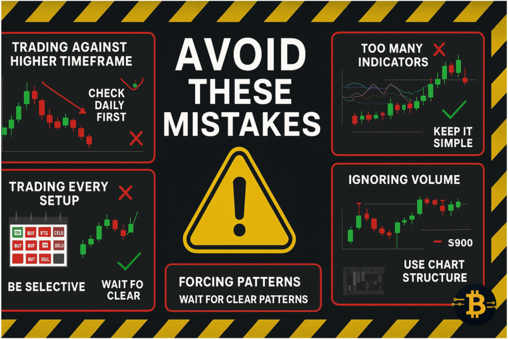
Common Mistakes When Reading Crypto Charts
Understanding what not to do is as important as knowing what to do. These mistakes cost beginners thousands of dollars annually.
Mistake 1: Ignoring the Higher Timeframe Trend
The biggest error beginners make is trading counter to the daily trend based on 15-minute chart patterns.
Why it’s costly: The larger timeframe always wins eventually. You might catch a 15-minute uptrend in a daily downtrend, but it’s swimming against the current. Profits are limited and risk is high.
Solution: Always check the daily chart first. Trade only in the direction of the daily trend until you’re experienced enough to identify genuine reversal points.
Mistake 2: Trading Every Pattern You See
Pattern recognition is a skill, but not every pattern deserves a trade.
The problem: Beginners get excited after learning patterns and see them everywhere. They trade low-quality setups in unfavorable conditions, leading to losses.
Solution: Be selective. Trade only high-quality patterns that form at significant support/resistance, align with the trend, and confirm with volume. Let perfect setups come to you—don’t force trades.
Mistake 3: Using Too Many Indicators
Indicator overload creates “analysis paralysis.” You find one indicator saying buy while another says sell, leading to confusion and missed opportunities.
Why it happens: Beginners think more indicators mean more accuracy. In reality, indicators often show similar information in different formats.
Solution: Master 2-3 indicators deeply. Moving averages + RSI + volume is sufficient. Once you’re consistently profitable with these, consider adding others.
Mistake 4: Neglecting Volume Analysis
Volume is the market’s heartbeat. Ignoring it means missing critical information about the conviction behind price moves.
Common scenario: Bitcoin breaks above resistance on your chart. You enter long, excited about the breakout. But volume was below average – it’s a weak breakout that quickly reverses, stopping you out.
Solution: Never evaluate price action without checking volume. Strong moves need strong volume. Low volume moves often reverse quickly.
Mistake 5: Setting Stops Too Tight
Beginners often set stop losses too close to their entry, getting stopped out by normal price volatility.
The pain: You enter Bitcoin long at $100,000 with a stop at $99,500. Bitcoin dips to $99,200, stops you out, then rallies to $104,000. You were right about direction but got stopped by noise.
Solution: Set stops based on chart structure (below support, not arbitrary percentages) and accept that some trades need 5-10% breathing room. Tight stops feel safer but actually lose money by generating frequent small losses.
Mistake 6: Revenge Trading After Losses
After a losing trade, emotional traders immediately enter another position to “win back” the loss. This desperation leads to poor decisions.
Psychology: Losses trigger emotional responses. You want to prove the market wrong. You abandon your analysis system and trade impulsively.
Solution: After a loss, step away from charts for at least one hour. Review what went wrong objectively. Don’t enter another trade until you’ve regained emotional equilibrium.
Mistake 7: Expecting Perfection
No technical analysis method wins 100% of trades. Expecting it to creates disappointment and erodes confidence.
Reality check: Professional traders aim for 40-60% win rates with favorable risk-reward ratios. Three losers followed by two winners can still be profitable if winners are larger than losers.
Solution: Focus on process, not individual outcomes. Did you follow your analysis system? Did you respect your stop loss? Did you take profits at your target? If yes to all three, it was a successful trade even if it lost money.
Mistake 8: Forgetting Risk Management
Technical analysis tells you where to enter and exit, but position sizing determines whether you survive long enough to profit.
The danger: You perfectly analyze a Bitcoin trade with 70% probability of success. You risk 50% of your account. The 30% chance hits, and you lose half your capital. Now you need a 100% gain just to break even.
Solution: Never risk more than 1-2% of your total capital on any single trade. If your account is $10,000, risk $100-200 per trade. This ensures you survive losing streaks.
Frequently Asked Questions
What do candlesticks mean in crypto?
Candlesticks in crypto show four key price points: open, close, high, and low for a specific time period. Green candlesticks mean the closing price was higher than the opening price—buyers won that period. Red candlesticks mean the closing price was lower—sellers won. The body represents the open-close range, while wicks show the extreme high and low prices reached.
What is support and resistance in cryptocurrency?
Support is a price level where buying pressure prevents further decline, acting as a floor under the price. Resistance is where selling pressure prevents upward movement, acting as a ceiling. These levels form at points where price has historically reversed, creating psychological barriers that traders watch closely.
How do you read crypto charts for beginners?
Start with the daily chart to identify the overall trend. Mark major support and resistance levels with horizontal lines. Check if price is above or below the 200-day moving average. Look at volume to confirm price moves. Identify any clear chart patterns. Add RSI to gauge momentum. Only trade in the direction of the daily trend initially.
What is the best timeframe for crypto trading?
The best timeframe depends on your strategy. Day traders use 5-15 minute charts for quick entries and exits. Swing traders analyze 4-hour to daily charts for positions lasting days to weeks. Long-term investors focus on daily to weekly charts. For beginners, the daily chart is recommended—it filters out market noise while showing meaningful trends.
What do green and red candles mean in crypto?
Green candles indicate the price closed higher than it opened during that time period—buyers had control and pushed price up. Red candles indicate the price closed lower than it opened—sellers dominated and pushed price down. The size of the candle body shows how strong that buying or selling pressure was.
How accurate is technical analysis in crypto?
Technical analysis isn’t about prediction accuracy—it’s about probability and risk management. Good technical analysis gives you a slight edge, turning a 50/50 random guess into 55/45 or 60/40 favorable odds. Combined with proper risk management, this small edge compounds into profits over many trades. No method predicts with certainty, but technical analysis helps you make informed decisions rather than emotional guesses.
What is a bull flag pattern in crypto?
A bull flag is a continuation pattern showing a brief consolidation after a strong upward move. The “flagpole” is the initial sharp rally. The “flag” is a tight, downward-sloping consolidation that follows. When price breaks above the flag’s upper trendline with volume, it signals the uptrend will likely continue. It’s called a “flag” because the pattern visually resembles a flag on a pole.
How do I know if a crypto trend is ending?
Watch for these warning signs: weakening momentum (smaller price moves), volume declining during rallies, trendline breaks with conviction, failed attempts to make new highs (or lows), and bearish (or bullish) divergences on RSI or MACD. No single sign confirms a reversal—wait for multiple signals and a clear break of the trend structure before assuming the trend has ended.
Should beginners use technical indicators?
Yes, but keep it simple. Start with moving averages (50-day and 200-day), RSI for momentum, and volume for confirmation. Master these three before adding others. Indicators help confirm what you see on the price chart but shouldn’t be your only decision-making tool. Learn to read raw price action first, then add indicators to enhance your analysis.
What is the 200-day moving average in crypto?
The 200-day moving average shows the average closing price over the past 200 days. It’s the most important long-term trend indicator. When price is above the 200 DMA, the long-term trend is bullish. When below, it’s bearish. The 200 DMA also acts as dynamic support during uptrends and resistance during downtrends. Bitcoin and major cryptocurrencies respect this level remarkably well.
Final Thoughts: Your Chart Reading Journey
You now understand how to read cryptocurrency charts from fundamentals to advanced patterns. You know that candlesticks tell stories about buyer and seller battles, support and resistance create psychological barriers, trends show market direction, and indicators confirm your analysis.
Most importantly, you understand that chart reading isn’t about predicting the future with certainty. It’s about identifying high-probability scenarios and managing risk appropriately. Even the best chart analysis loses sometimes – success comes from winning more than you lose and cutting losses quickly when wrong.
Start simple. Open TradingView, pull up Bitcoin’s daily chart, and practice identifying trends and support/resistance levels. Don’t trade real money yet. Paper trade for at least one month, documenting every analysis decision. Review both winning and losing trades to understand what worked and what didn’t.
Chart reading is a skill that improves with practice. Your first chart analysis attempts will feel awkward and uncertain. After analyzing 100 charts, patterns start clicking into place. After 1,000 charts, you’ll spot high-quality setups within seconds. The journey from beginner to competent takes months, not days – but every expert trader started exactly where you are now.
Remember: The goal isn’t to become a day trader (unless that interests you). The goal is to make informed investment decisions based on objective data rather than emotions or hype. Whether you’re investing for the long term or actively trading, understanding crypto charts gives you a massive advantage over those who buy and sell based on fear and greed alone.
Keep learning, stay patient with yourself, and focus on consistent improvement rather than perfect trades. The cryptocurrency market rewards those who put in the work to understand its language.
About This Guide
This comprehensive guide was created to help beginners master cryptocurrency chart reading without overwhelming technical jargon. The explanations prioritize practical understanding and real-world application over theoretical perfection.
Transparency note: This content is educational only and does not constitute financial, investment, or trading advice. Cryptocurrency trading involves substantial risk. Never invest more than you can afford to lose. Always conduct your own research before making financial decisions.
The examples used throughout this guide are for illustrative purposes and do not represent recommendations to buy or sell any cryptocurrency.
Ready to practice? Open TradingView, select Bitcoin on the daily chart, and start identifying the concepts you’ve learned. Remember – every expert was once a beginner who refused to give up.
References
Anyaku, S. (2025, December 6). How to invest in bitcoin for beginners: 7 low-risk ways. Cryptogiant –. https://cryptogiant.io/how-to-invest-in-bitcoin-for-beginners-with-low-risk/
Dolan, B. (2003, November 23). What Is MACD? Investopedia. https://www.investopedia.com/terms/m/macd.asp
Fernando, J. (2003a, November 24). Moving average (MA): Purpose, uses, formula, and examples. Investopedia. https://www.investopedia.com/terms/m/movingaverage.asp
Fernando, J. (2003b, November 25). Relative strength index (RSI): What it is, how it works, and formula. Investopedia. https://www.investopedia.com/terms/r/rsi.asp
Hayes, A. (2003, November 24). Master technical analysis: Unlock investment opportunities and trade strategies. Investopedia. https://www.investopedia.com/terms/t/technicalanalysis.asp
Thompson, C. (2003, November 23). Understanding Bollinger Bands: A key technical analysis tool for investors. Investopedia. https://www.investopedia.com/terms/b/bollingerbands.asp
Thompson, C. (2018, May 11). Understanding Basic Candlestick Charts. Investopedia. https://www.investopedia.com/trading/candlestick-charting-what-is-it/
TradingView – track all markets. (n.d.). TradingView. Retrieved December 13, 2025, from https://www.tradingview.com
What is cryptocurrency? Beginner’s guide 2025. (2025, October 7). Cryptogiant –. https://cryptogiant.io/what-is-cryptocurrency/
(N.d.-a). Coinbase.com. Retrieved December 13, 2025, from https://www.coinbase.com
(N.d.-b). Kraken.com. Retrieved December 13, 2025, from https://www.kraken.com
(N.d.-c). Binance.com. Retrieved December 13, 2025, from https://www.binance.com
1 Comment
Pingback: Top 10 Crypto Trading Tools Every Trader Should Know